

Why Our Analysts Stopped Chasing Dashboards and Built a System Instead
\ \ While backend and frontend engineers are continuously working on improving the company’s core products, the Data Science team is focused on embedding a Data-Informed culture across these products. The goal is to ensure that all decisions — regardless of their scale — are made based on data analysis and metric performance. And it’s precisely those metrics we’ll be talking about below.
In-depth analysis of product metrics inevitably involves human input. A dedicated team of analysts is responsible for regularly extracting data, building dashboards, and providing timely updates to product development managers so they have a full picture of product performance and can plan improvements accordingly.
However, at a certain stage of a company’s growth, this manual approach to data analysis reaches a critical mass, triggering a chain reaction of reporting backlog. Analysts begin to struggle with the ever-increasing number of requests. There are a few ways to solve this challenge — by expanding the analytics team or by automating most of the work through the development of an automated product metrics monitoring system. We chose the latter.
\
Architecture
Let’s start by looking at the full architecture of the proposed system right away. After forming a silent conceptual understanding in our minds, we’ll walk through the entire development process step by step.
\ 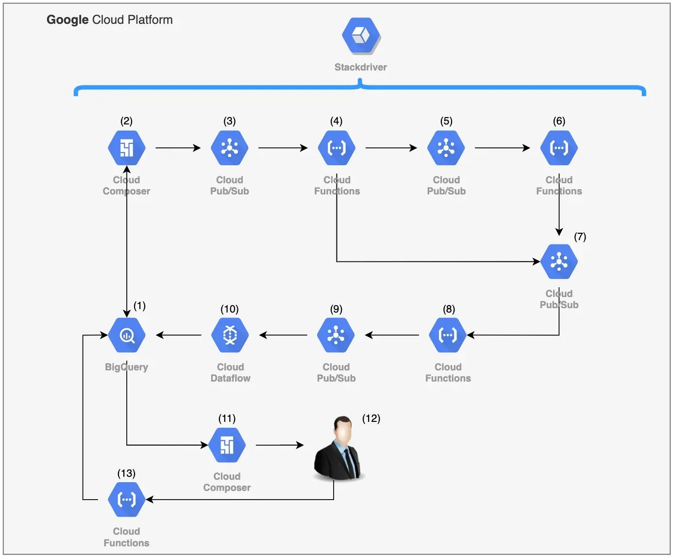
\ From the information diagram, it’s immediately clear that the system was built using Google Cloud Platform services. This technology stack was chosen for several reasons:
\
- First, cloud platforms like Amazon Web Services, Microsoft Azure, or Google Cloud Platform allow even a small group of developers to deploy fairly complex and large-scale systems in a short period of time — allowing them to focus on inter-component processes and writing code. The cloud provider takes care of everything else, including logging, horizontal scalability, and fault tolerance.
- Second, it’s impossible to analyse data if it’s not stored anywhere. In our case, the data warehouse was built using the columnar database BigQuery, and the metrics monitoring system can be seen as an application built on top of that warehouse. It’s only logical to use tools from the same platform rather than trying to force competing cloud services to work together.
\
Data Delivery
In most cases, product metrics can be represented as time series and analysed using mathematical statistics or machine learning algorithms. Time series analysis can include a wide range of operations: checking for stationarity, smoothing, forecasting, anomaly detection, or simple visualisation. When dealing with a large number of such time series (around 100,000), it’s crucial to clearly define which type of analysis is the most important. We chose to focus on anomaly detection — identifying unusual drops or spikes in metrics — based on historical data. \n
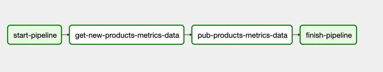
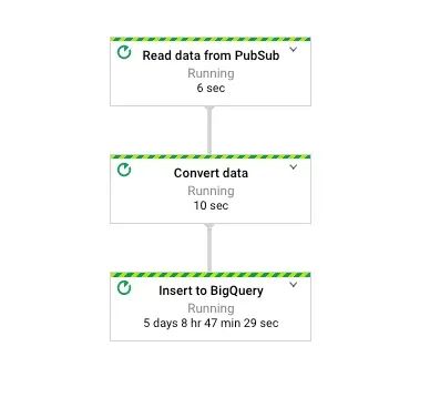
To retrieve up-to-date data for the product metrics we’re interested in and to aggregate them into time series for further analysis and anomaly detection, we use the Composer service, which is built on the open-source solution Apache Airflow (https://airflow.apache.org/). Through asynchronous DAG processes, the service enables us to extract the required data from the data warehouse using SQL (a familiar tool for any analyst), generate time series from it, and send those series for analysis in JSON format at the desired frequency.
\ 
\
Analytics
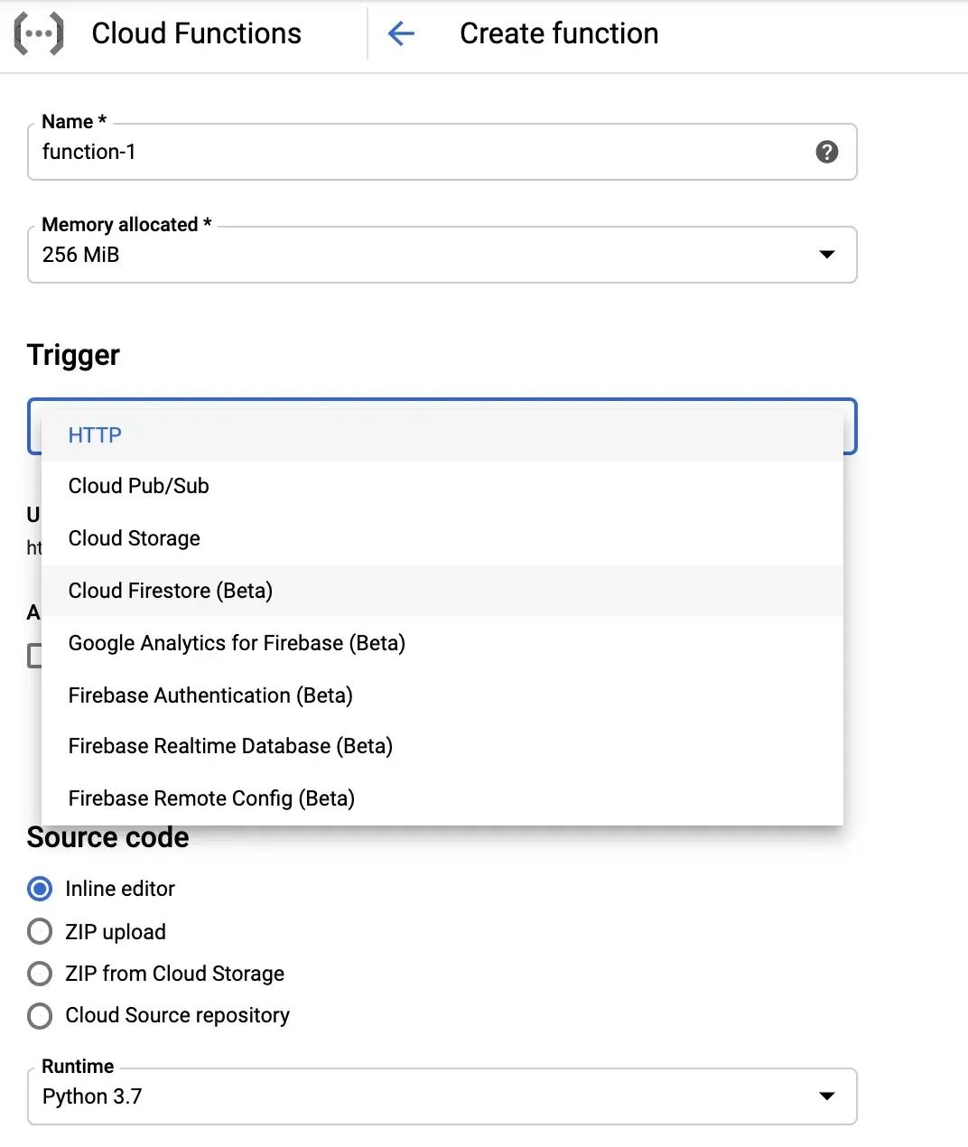
All the logic and specific methods for anomaly detection in time series were developed using Pub/Sub message queues and Cloud Functions microservices, which operate based on trigger events. The list of triggers for Cloud Functions is quite broad, but the most commonly used are: the appearance of a message in a Pub/Sub queue (which the microservice subscribes to), and the sending of a direct HTTP request to a specific microservice. When working with large volumes of data, using queues allows for smooth load balancing and gradual scaling.
\ 
\ How we organised the time series analysis logic:
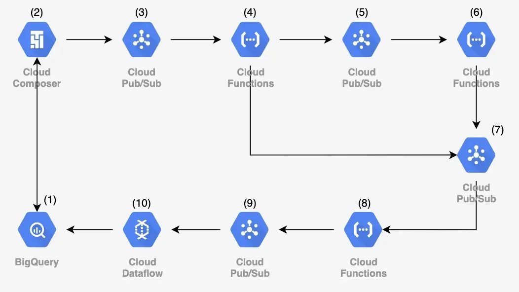
\ Here’s how we organised the logic for time series analysis: \n Using several baseline methods (such as comparing the current value of a metric to predefined thresholds and a number of standard statistical techniques for anomaly detection), we neededarouting microservice[4] that would choose the most appropriate analysis method based on the properties and attributes of the time series. If threshold values (targets) were available, the analysis would be performed directly within the router. After that, the series is passed to a microservice queue that determines whether it’s necessary to send an alert about the detected anomaly [8]. There’s no point in reporting every minor deviation from expected behavior — but it’s still worth recording such insights. \n In cases where no predefined “normal” bounds exist for the metric, the time series is sent to a microservice that applies statistical analysis methods [6].
The architecture of our system was designed so that both the entry and exit points lead to the central data warehouse. As a result, all the insights generated about product metrics remain accessible to any analyst. However, this approach has one major downside: the warehouse is subject to a high volume of queries and dashboard generation. We couldn’t allow our system’s bulk data writes to impact the performance of the main data store. \n This issue is addressed usingETL processes via the Dataflow service [10].
\ As with many services in the Google Cloud Platform, the technical foundation of Dataflow is an open-source solution — Apache Beam (https://beam.apache.org/). It provides a unified model for building both batch and streaming ETL pipelines.
\
User feedback
Knowledge is meant to be shared, and the metric monitoring system was developed precisely for that purpose — to share insights about a large number of product metrics with all interested employees across the company.
\ 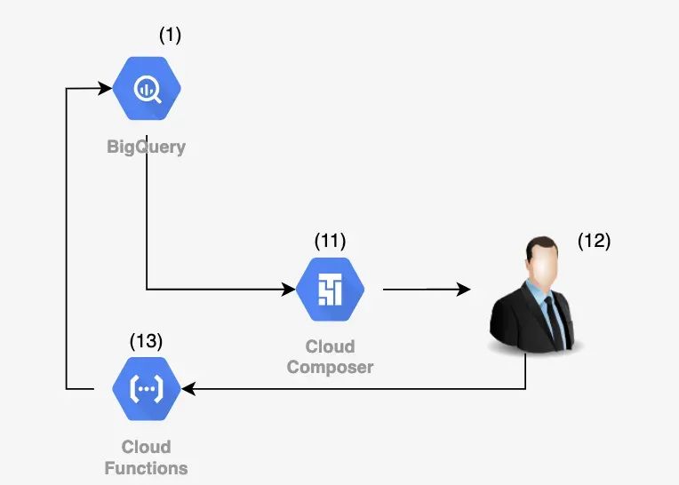
\ To achieve this, the system automatically generates personalised weekly reports on major detected anomalies. Once again, the Composer service [11] assists us in this task. The idea of daily reports was set aside, as practice shows that people generally don’t appreciate a flood of emails filled with charts and numbers. Therefore, a weekly digest format best meets the analytical reporting needs.
Additionally, to enable more productive interaction between the system and the end user, a feature was added allowing users to mark detected anomalies as false positives [13]. These markings are then used for future iterations of data analysis.
\
Conclusion
I hope I’ve been able to conceptually convey our team’s approach to solving the challenge of automated data analysis. In terms of development effort, the MVP was delivered by 1.5 developers in less than two months, and the daily cost of using Google Cloud Platform infrastructure amounts to $40. The solution has proven to be highly valuable to both analysts and the company’s top management, which is why we’ve already planned experiments with services providing infrastructure for machine learning.
\n
You May Also Like

U.S. Court Finds Pastor Found Guilty in $3M Crypto Scam

MSCI’s Proposal May Trigger $15B Crypto Outflows
